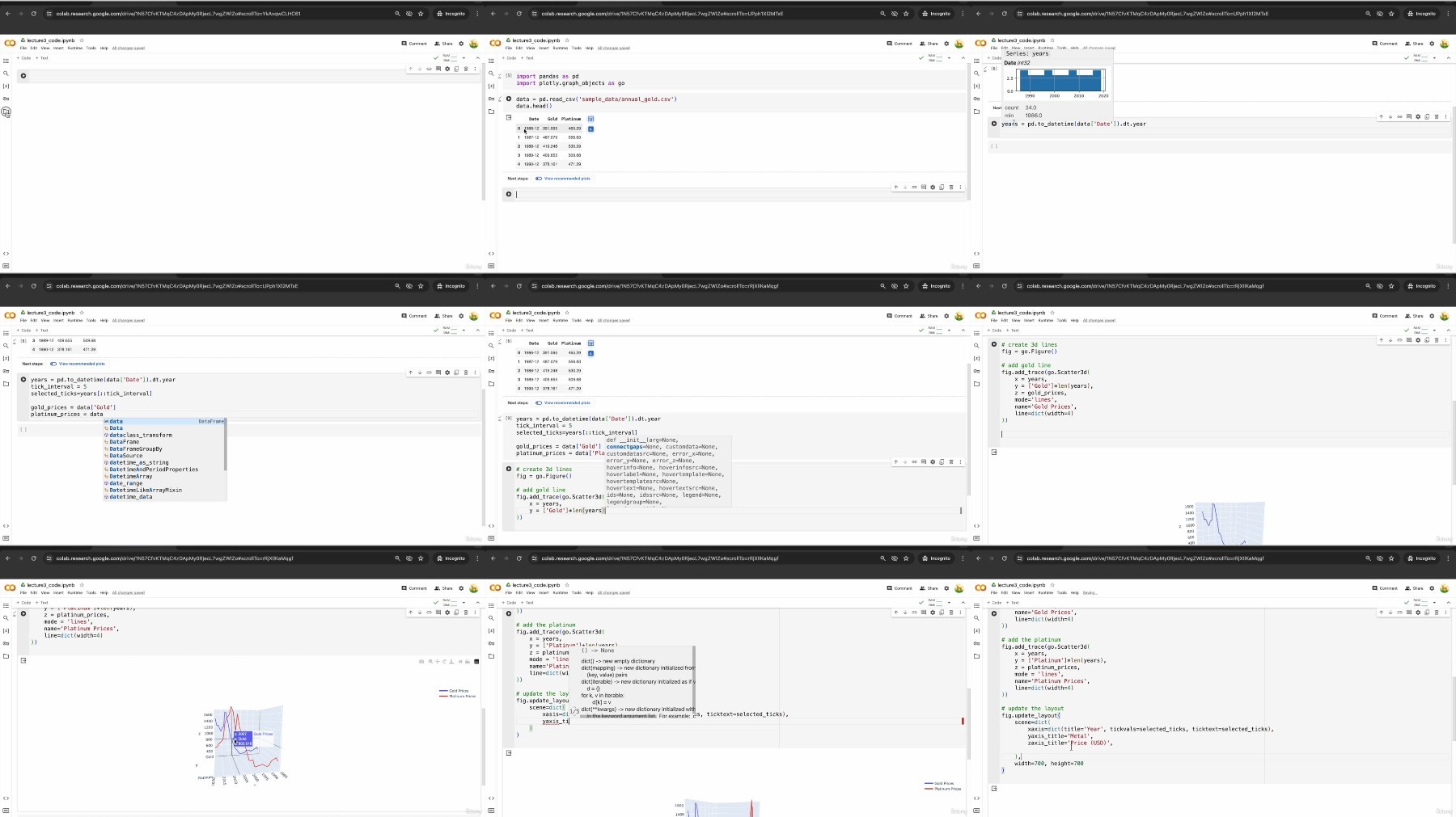
3D Interactive Data Visualization Using Python Plotly
Published 4/2024
MP4 | Video: h264, 1920x1080 | Audio: AAC, 44.1 KHz
Language: English
| Size: 345.12 MB[/align]
| Duration: 0h 50m
Create Interactive Visual Representations using Python Plotly and Matplotlib Library
[b]What you'll learn[/b]
Be proficiency in Python for data visualization, learning to use libraries such as Plotly and Matplotlib
Master the skills necessary to design and implement 3D surface plots, and understand how to visually express complex nonlinear relationships in data
Apply principles of design and aesthetics to create clear, informative, and visually appealing plots
Gain practical experience through hands-on projects via real-world data sets
[b]Requirements[/b]
It would be great if learners know basic python syntax.
[b]Description[/b]
Embark on a journey to master the art of 3D interactive data visualization with our comprehensive course, designed for enthusiasts at all levels. In this class, you will dive deep into the exciting world of dynamic graphing techniques using Python and Plotly in Google Colab environment. This course begins by introducing the fundamental concepts necessary to understand 3D visualization. You will learn how to manipulate data and use Plotly's powerful features to create visually appealing and informative graphs. Throughout the course, you will engage in four major projects that not only reinforce learning but also enhance the ability to analyze and present data effectively.The first project involves constructing a 3D interactive nonlinear function graph, where you will learn how to represent complex mathematical functions shown in 3D space. The second project shifts focus to a 3D interactive scatter plot, perfect for visualizing patterns, correlations, and outliers in multivariate data. The third project, a 3D interactive line plot, will help you track changes over time and space, offering insights into dynamic datasets. Finally, the course culminates with a project on creating a 3D interactive random walk, an exciting way to simulate and analyze random processes in three-dimensional space.By the end of this course, you will not only be proficient in using Python and Plotly to create advanced 3D visualizations but also equipped to apply these skills in real-world scenarios. Whether you're a student, data analyst, or enthusiast, this course will help you turn complex data into compelling interactive visual stories, enhancing your analytical and presentation skills.Join us to transform your data visualization capabilities and bring your data to life in three dimensions!
Overview
Section 1: Introduction
Lecture 1 Introduction
Section 2: Visualizing 3D Interactive Nonlinear Function
Lecture 2 Visualizing 3D Nonlinear Function using Python and Plotly
Section 3: Visualizing 3D Scatter Plot
Lecture 3 Visualizing 3D Scatter Plot Using Plotly | Wine Quality Data
Section 4: Visualizing 3D Grouped Line Chart
Lecture 4 Visualizing 3D Grouped Line Chart | Time Series Asset Data
Section 5: Visualizing 3D Random Walk
Lecture 5 Visualizing 3D Random Walk Using Plotly
Data Scientists and Analysts,Researchers and Academics
https://fikper.com/BZxltSbnNG/3D.Interactive.Data.Visualization.Using.Python.Plotly.zip.html
https://rapidgator.net/file/dd9723122ba5f556d7b1c578b7b83d81/3D.Interactive.Data.Visualization.Using.Python.Plotly.zip
Free search engine download скачать: 3D Interactive Data Visualization Using Python Plotly

