MP4 | Video: h264, 1280x720 | Audio: AAC, 44.1 KHz
Language: English | Size: 681 MB Duration: 1h 21m
Python is one of the most popular and advanced programming language used in various domains such as machine learning and data science. Python helps you reduce the lines of code into as short as possible while keeping it in a readable format so that anyone can easily understand the implication of python code. In this course you will learn about some of the libraries in python and some methods used to create data visualization charts and data science projects. Here, you will learn about creating data visualization charts using python and Power BI business intelligence software. Power BI is an advanced software used for wide range of application areas such as Data Science, Machine Learning, Enterprise Resource Planning, Data Analysis and much more. And it makes the process of data cleaning, modelling and visualization very interactive and easy.
Although we could create various kinds of charts in Power Bi even without writing a single line of code. But there are various complex problems in data science that can be solved with the help of python libraries such as matplotlib and seaborn. Here in this course you will learn to create some of the advanced charts in power bi by writing python programs to create data visualizations for driving insights and finding outliers that may not be done by using default charts, one such example could be Violin chart. By creating a Violin chart you could easily spot the distribution range or concentration of values based on a certain category. This chart would make it intuitive to spot any segregation of values, and uniformity of distribution. It would be very difficult to represent such insights using any other default charts. Moreover, you would be learning many of such advanced custom charts in power bi that can be created by writing python codes.
The skills you learn in this course can be used in various domains related to data science and data analytics to business intelligence and machine learning.
In this course, you will be learning following concepts and visualization charts using python libraries such as pandas, matplotlib and seaborn-
Installing python packages and defining path
Creating a Line chart with matplotlib
Putting labels and creating dashed scatterplot
Violin chart with seaborn
More on Violin chart
Stripplot
Boxplot
Lmplot or align plot
Moreover, you will also learn to create other visualization charts in power bi and other concepts such as creating slicer filters and map chart-
Ribbon Chart
Table and Matrix
Drill Down Table and Matrix
Donut Ring chart
Simple Map and modes
Slicer- Basics
Slicers- Date Slicer
Before taking this course you must have power bi and python installed on you computer.
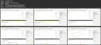
Screenshots

Homepage
https://www.skillshare.com/classes/Data … 1793699281
download скачать
https://nitroflare.com/view/E2B65107FFB9E8E/eu3td.Data.Visualization.with.Python.and.Power.BI.rar
https://rapidgator.net/file/616a7de14192ed1275c72a7053cd768f/eu3td.Data.Visualization.with.Python.and.Power.BI.rar
- Подпись автора
www.prizrak.ws Аниме Форум. Софт, игры, фильмы, музыка, anime скачать бесплатно ^_^

